Capital one Watermark hotel
Creating a distinct hospitality brand within the Capital One Center campus.
The Watermark Hotel needed to feel connected to the larger Capital One Center development while establishing an identity entirely its own. The goal was to create more than a place for business travelers to stay. It needed to feel polished and elevated, but also warm enough to become a neighborhood destination for local guests.
I led the development of the brand world across identity, messaging, digital content, print collateral, and environmental applications. The visual system pairs a modern, architectural sensibility with refined materials and thoughtful details, reflecting both the contemporary property and the experience inside it.
From the exterior building mark to lobby signage, guest touch points, and branded collateral, every element was designed to create a cohesive sense of place.
All work done as a part of Collins + Co.
my rolE
Executive Creative Direction
Brand Development
Art Direction
Digital Content
Print Collateral
Environmental Signage
THE WORK
A hospitality identity rooted in place
The Watermark needed to feel like a natural extension of the Capital One Center campus without becoming visually interchangeable with it. We created a standalone hospitality identity that felt modern, elevated, and architectural while still offering the warmth expected from a neighborhood hotel.
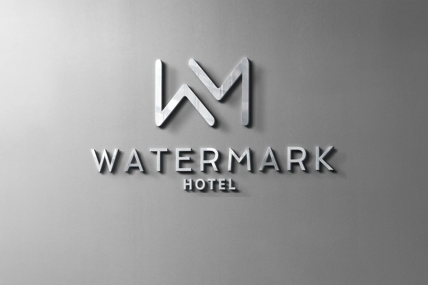
The interlocking “W” and “M” monogram became the foundation of the system. Its clean geometry complemented the property’s contemporary architecture and gave the hotel a recognizable mark that could scale from the building exterior to the smallest guest touchpoint.
A cohesive brand across the guest journey
The brand was designed to function as an experience, not simply a logo. I led the creative direction across exterior and interior signage, printed collateral, digital content, and environmental applications so that every interaction felt connected.
The restrained visual language, refined typography, neutral palette, and metallic finishes reflected the materiality of the hotel itself. Together, these elements created a consistent sense of place from the moment guests saw the building to the details they encountered inside.
Environmental branding integrated with the architecture
Because the identity would live prominently throughout the physical property, it needed to work in direct conversation with the architecture and interiors.
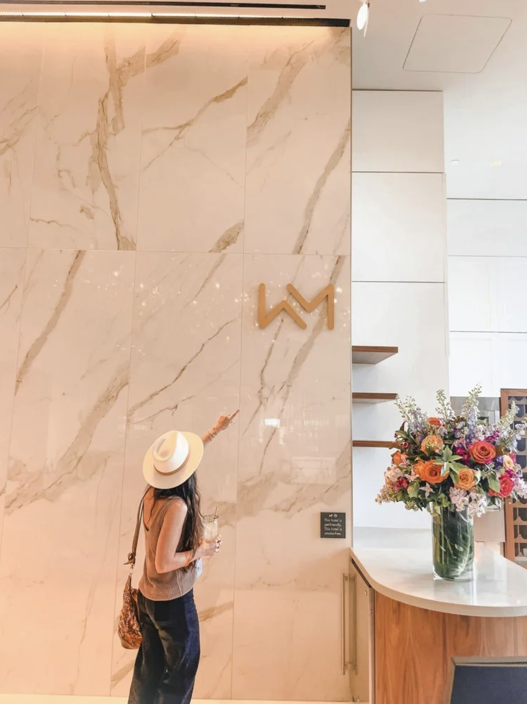
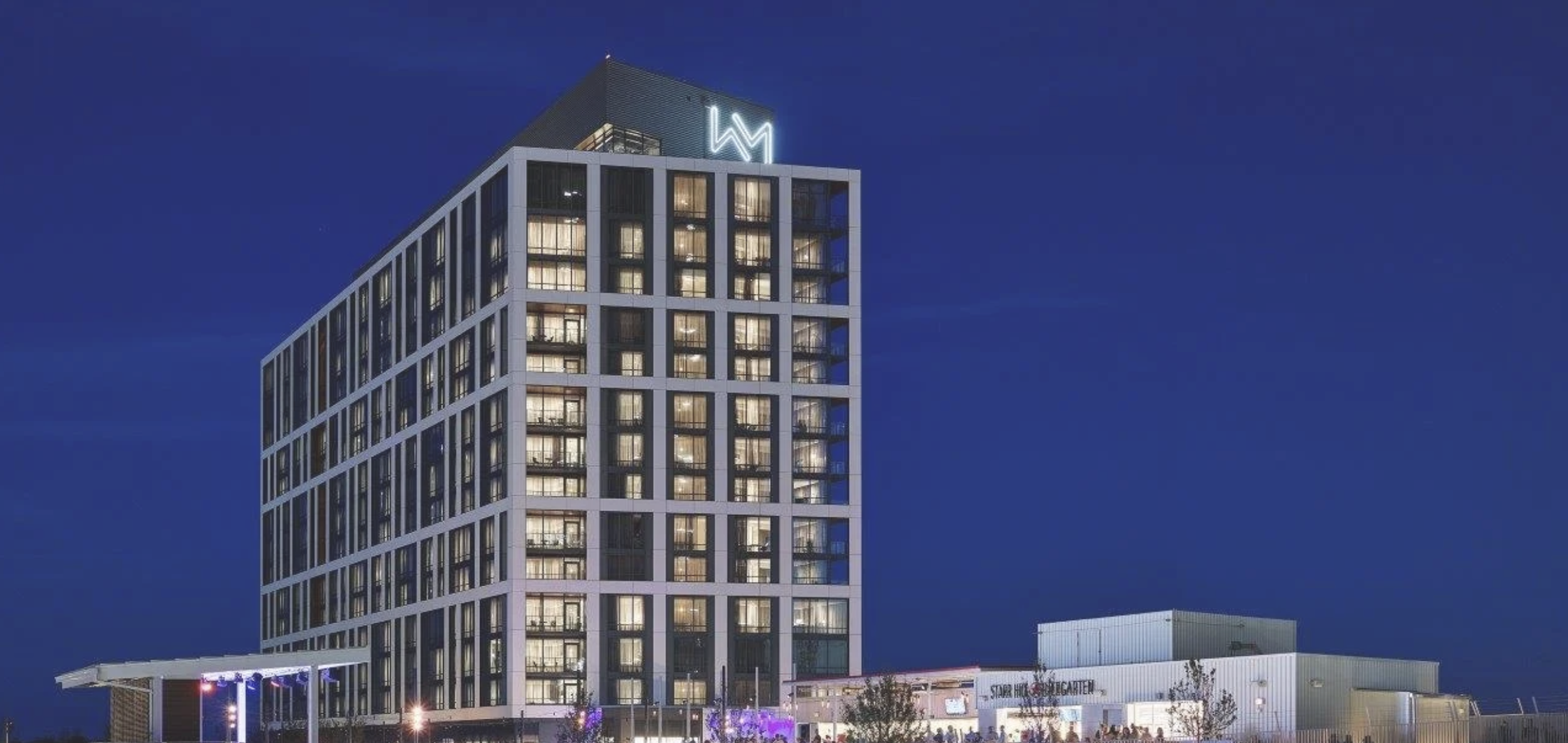
We developed exterior building signage, lobby applications, dimensional marks, and wayfinding elements that felt integrated rather than applied after the fact. Material choices and fabrication details were carefully considered so the identity could hold its own across glass, metal, stone, and marble surfaces.
Guest-facing collateral and digital touchpoints
The visual system extended across the practical materials guests would interact with throughout their stay, including stationery, printed collateral, promotional communications, and digital content.
Each application was intentionally minimal, allowing the identity, materials, and hospitality experience to do the work without unnecessary decoration. The result was a flexible system that could feel polished in a corporate context while remaining welcoming to leisure travelers and members of the surrounding community.
A hotel designed to serve more than one audience
The Watermark had to speak to several audiences at once: Capital One employees and business travelers, overnight leisure guests, and local residents visiting the broader campus.
The brand world balanced those needs by avoiding both conventional corporate hospitality and overly trend-driven boutique hotel cues. It positioned The Watermark as a sophisticated destination with enough personality to become part of the neighborhood, not simply a place to stay while visiting the campus.